MyFitnessPal
UX Design, UX Research
2018
Track what you eat. A calorie tracking app, where you start by entering your height, weight, and age, how much weight you want to lose over a specific amount of time. As I was using the app regularly, I found some issues that are pointed out in this case study with some possible improvement areas being laid out.
What I like about the app
Features that I found quite useful
- Auto-sync of my daily steps
It syncs automatically from Apple’s Health app. Which adds up to the calorie limit. - A huge database of foods to search from
Approx 6 million foods. - Barcode scanning
I can easily add the calorie count from a packaged product by scanning. - Swipe to Quick Add
From the search result, I can swipe the right to quickly add it. - Categorized food entry
Breakdown of breakfast, lunch, dinner & snacks. - Add Workouts
They have a list of predefined workouts to choose from.
What I don’t like
Features that felt unintuitive and need improvements
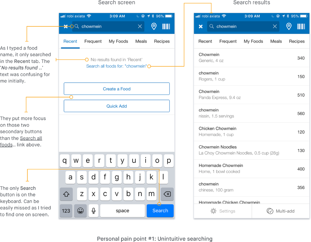
- Unintuitive searching
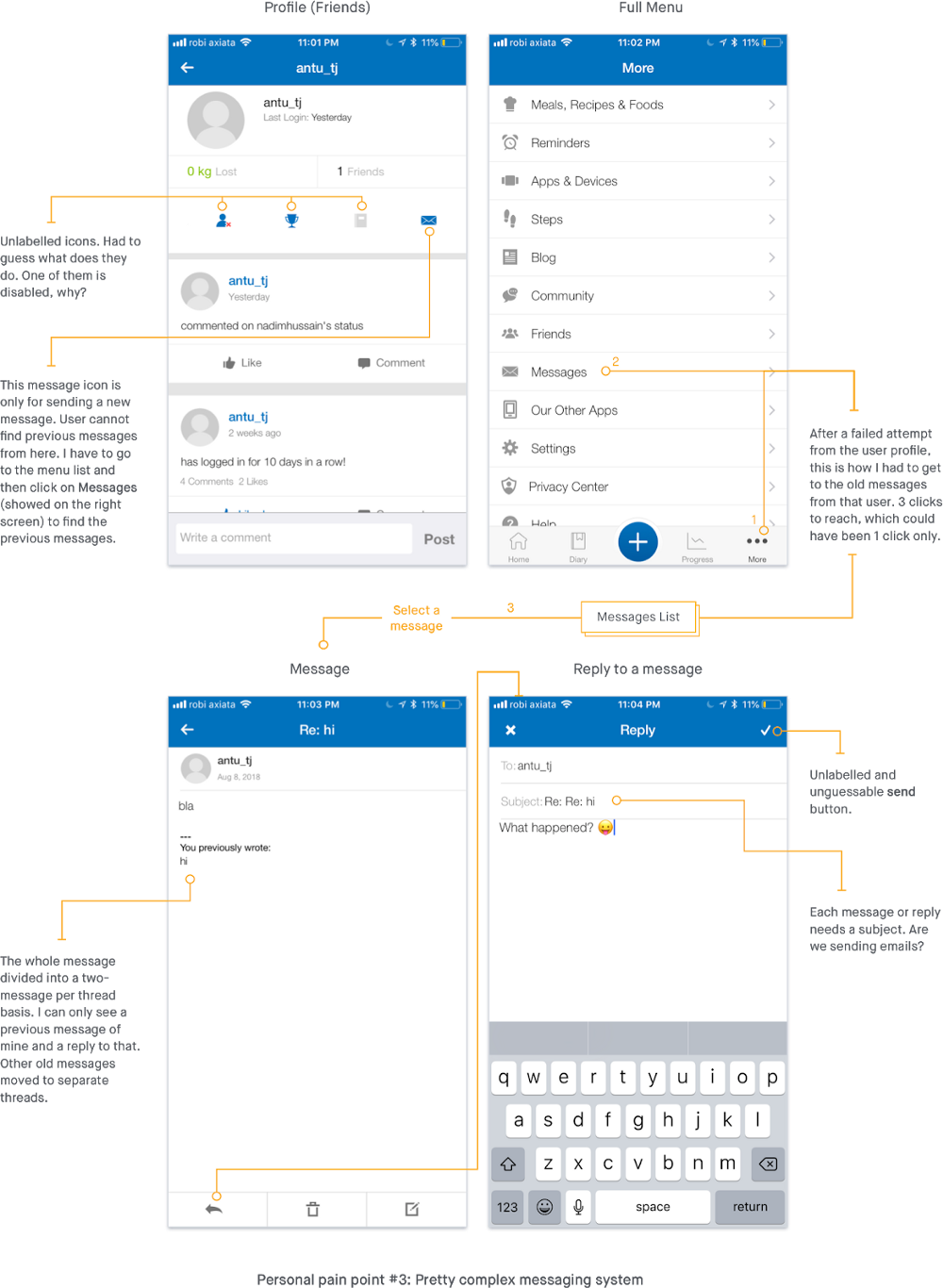
It doesn’t search automatically while you type. There is no on-screen ‘Search’ button as well. Only one on the keyboard and one on-screen seemed like a link that is not that noticeable. Initially, one would feel like the food is not available in the database. Same case with the search for exercises. - Communicating with a friend is confusing
This app has a good community of health-conscious people. But the social features are lacking big time. If you want to send a message to a friend, you have to put a subject on it (am I emailing!). Profile pages are also not that good. Notifications are not organized. - Unorganized landing screen with blogs (lots of them!), friends posts, and not personalized ads.
The main focus on the homepage should be on the macro tracking feature. But, it’s filled with a lot of blog posts and some posts from friends. It could be much cleaner if it was separated with tabs above or giving the ability to choose what to see.There should be a link or button to go to my profile with a single tap. The profile is important here to edit my goals. Those are my pain points with the app. I should have the ability to curate my feed.
Adding new features
From the usability testing and other user research, we keep a tracker of the features users are demanding. We can also analyze the app store reviews to find out feature requests, user pain points, and suggestions. We can add the most demanded ones to the feature backlog and plan as a potential feature. New feature ideas can also come from competitive analysis. Or, from a hypothetical point of view of a product designer or any other team members.
The challenge is to give the user more convenient ways to track with nudges and feedback to make them reach their goals faster.
Top KPIs to consider
Defining the key KPIs from the product team’s perspective can be different from the business/sales teams. By monitoring the important KPIs regularly, the team can perfectly ensure smooth and intuitive UX. Top 3 KPIs that I would choose:
- Number of daily new user
Measuring acquisition can help to prove if the product is successful or not. If the product isn’t addressing the right customer need, then it may not attract new users. - Number of daily active user
Engagement can be the indicator to understand that it is getting the user’s job done and motivating them to come for more. It will also impact ad revenue from basic users. This includes the usage of calorie tracker, discovering new recipes, workouts. - % of conversion to premium membership (weekly/monthly)
When an engaging user upgrades themselves to the premium tier, it is a clear indicator that the app is serving its purpose. The extra benefits should be designed in such a way to retain those converted users.
Potential Features
After doing some research on app store reviews and competitive analysis, I found these potential features that can be added to the plan:
- In-app workout plans
Working out and eating healthy go hand in hand. With the combination of these, you get the best result. The app is already tackling the food tracking part and as a fitness pal (a friend) it should also guide me to the workout plans within the same platform. It can use some algorithms to identify what plan should be ideal for me along with my calorie intakes. After a heavy intake day, the app can suggest some high-intensity workouts. - Take the Health Score test
This means understanding the overall eating and lifestyle habit of a user from a series of questions (30–40). Based on that, a score to show how healthy your lifestyle is on a scale of 100. From this score, the app can suggest curated diet and workout plans. - Diet plans
Diet plans are mostly related to losing weight. MyFitnessPals’ approach to losing weight is to restrict calorie intake only. But, with proper meal plans, this can be a simpler and fun way to achieve the goal. The plans can be suggested by analyzing the user’s daily intake data (if enough available). Meal plans can also be for gaining weight or staying unchanged. - Create Challenges
The app can have some predefined weekly/monthly challenges where users can join and invite others. It can be a meal plan challenge or a workout challenge. The user will also have the ability to create their challenges and invite their friends. Competitive motivation can help the user reach their goals faster.
Feature Prioritization
Now that we got some potential features, it’s time to work with feature prioritization. This should be a cross-functional team task to discuss and apply prioritization methods to choose which features and initiatives to put on the task list by voting and discussions. There are always many features that can be competing for scarce resources.
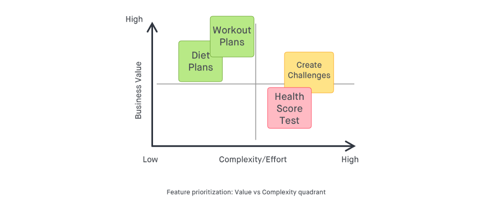
To decide the top two features from the potential ones I am using value versus Complexity Quadrant method to understand which feature has more business value and takes less effort. Also using a 2x2 Prioritization Matrix to better understand what points may be more important to both the business and the user.
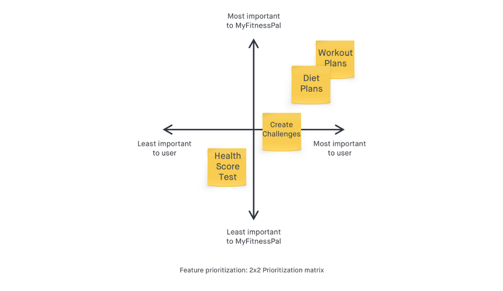
After analyzing these two prioritization methods, we can see that the Health Score Test would be a complex feature to develop than the others. Also, the business value might be lower in this case. Create challenges fall into the 3rd place compared to others. So, the two features that stand out here are:
- In-app Workout Plans
- In-app Diet Plans
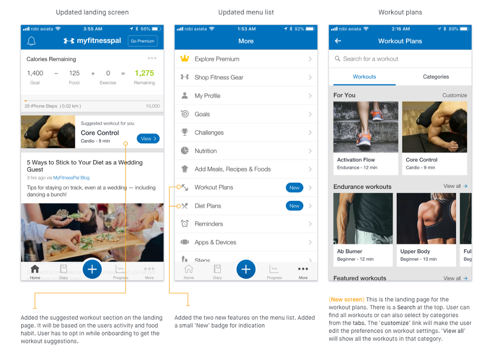
Quick Prototypes
I tried to create a quick prototype on focusing the workout plans
Validation Flow
Wasting an organization’s time and resources developing a feature that fails, can be an unpleasant experience for me as the product designer/manager. To quickly validate the features impact-ability we can do a user survey with the existing users and after getting a positive response we can do in-depth usability testing on an MVP. My validation plan for these new features is illustrated below
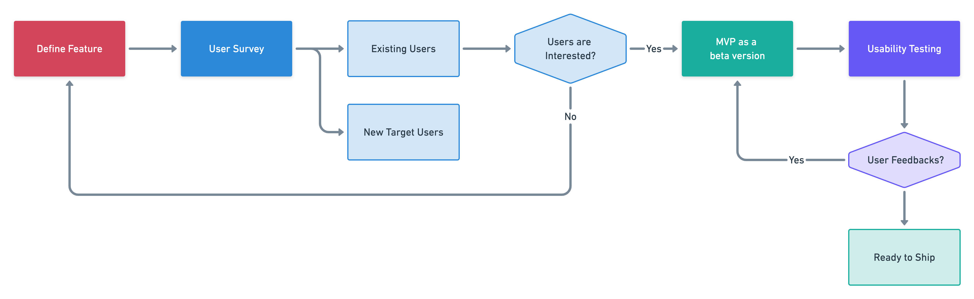
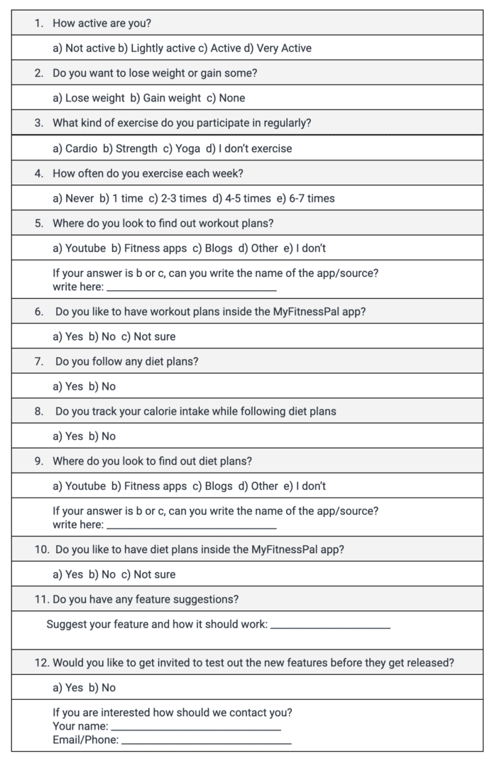
User Survey
Audience: Online population size of 150 for a sample size of around 100
The cohort the survey will be sent to will consist of
- 80% of existing active users
- 20% newly joined users
A mix of close-ended and open-ended questions:
Survey Data Analysis
If we use any online survey tools like Google Forms or SurveyMonkey, the analysis and visualization will be easier. Assuming that the survey data is captured over Google forms and we have the data visualization ready to analyze from.
Categorizing them in terms of different data types:
In the Questionnaires, we had a couple of ordinal data questions:
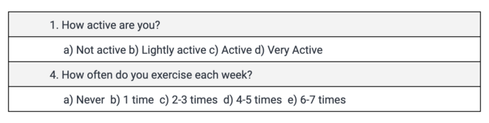
We can create two histograms from these data to understand what type of users are participated and how active they are.
Questionnaires with other data types we had in the survey are:
- Choice data types (e.g. Q#2)
- Yes/No data types (e.g. Q#7)
- String data types (e.g. Q#11)
After graphing the data for each of the sets, we can create histograms for each question (except the string data types) with their responses. From that, we will try to analyze if the majority of the users agreed/interested in getting these features.
Usability Testing
After getting a satisfactory result from the survey we can then move on to create an MVP in a beta version of the current app. Invite a group of interested participants for usability testing, should be an iterative process until the experience is satisfactory and intuitive. To get the best result from the usability testing, the user screening process should be well planned out. We should prioritize the existing old users. There can be some new users too, as there will always be new users joining the app.
The test plan should concentrate on areas with potential usability issues and should have proper test scenarios to address them. We should start with the easier task first and then move on to critical ones. A short discussion session can also be held after the testing session.
The testing will clear up any usability and navigation issues and will give us a strong base for the next steps of finalizing and shipping the features.
Conclusion
The features will meet the customer goals by providing them with an all-in-one solution to stay fit and in shape. A true fitness friend. A user doesn’t have to shuffle between multiple apps to follow different plans. As an in-app feature, more tailored contents can be suggested from the user insights.
It will also significantly contribute to the KPIs for this product. Workout plans are repetitive tasks and it will engage more users daily with the app. There will be some content under premium plans as well. For exclusive workout plans and diet plans, the user will be more convinced of the conversion to a premium user. The organizational strategies will find more success with an increase in active users and subscriptions.
Originally published on Medium
let's talk — [email protected]