TicketChai Flight Booking Web App
UX Design, UX Research
2018
Ticket Chai is an online platform for a one-stop B2C ticketing solution for air tickets while offering exciting tour packages. This case study will demonstrate how we built the air ticketing platform from scratch.
The Challenge
How can we improve the flight booking experience?
Although we have all the technology at our disposal, the flight booking experience has not become that much smoother yet. A lot of online consumers still face inconveniences in finding and booking flights. In most cases, the overall booking flow has some pain points. We tried to find and minimize that in our product.
My Role
As a UX designer, I take the responsibility of doing user research and finding users’ pain points, proposing design decisions from the research insights, designing wireframes and prototypes, preparing and managing design documentations.
The Team
Abdullah Al Noman, Head of tech
Babar Al Amin, Sr. Software Engineer (Rails Guru, Back-end)
Habibur Rahman, Software Engineer (Back-end)
Mahabub Islam Prio, Software Engineer (Back-end)
Mitul Islam, Software Engineer (Front-end)
Nasir Uddin, Software Engineer (Front-end)
Our UX Process
We work on this non-linear flow to make a great product.
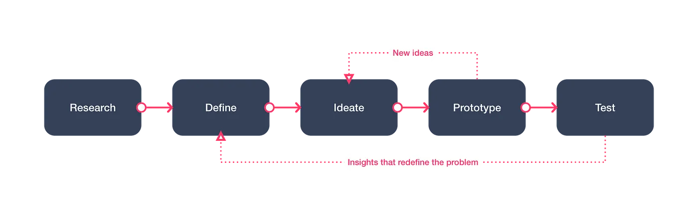
Research
Identifying the user needs
We have done a survey on different ages of people to understand users’ needs and motivations. We put ourselves in the passenger’s shoes to understand and implement the user-centric design. Those surveys and analyses helped us to come up with a simpler yet effective and efficient product strategy.
Targeted Users
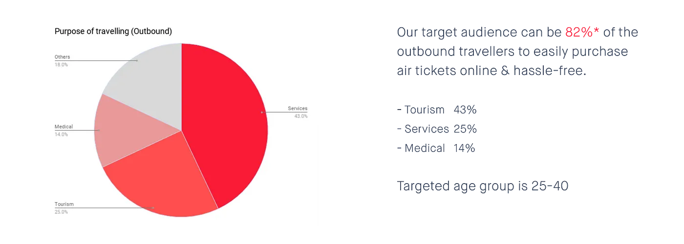
Online vs Offline purchases
Analyzing different reports and from our own survey, we have found out that only 30% of the total travelers (Tourism and Services) use online flight booking websites to purchase their tickets.
Key Pain Points
01. Search & Navigation
As soon as a user lands on the website, their customer experience begins. Simple navigation and search functions are vital to ensure this is a seamless process. However, ‘search and navigation’ was the largest problem area identified in our report, with 37% of negative feedback specifically referencing it
02. Flight Listing & Filtering
Flight selection is another important flow of the flight booking journey. A user tends to compare and select a suitable flight for them. But, around many websites have a messy listing page with tons of filters and data shown in a non-user friendly way. This page needs to be clean and easy to navigate through.
03. Sign in/Sign up
4 out of the 5 survey participants tend to not prefer long sign-in/sign up process in the middle of the booking. Guest booking is a solution to this issue. Another approach can be simplifying the sign-in/sign up process. That will allow the user quickly and easily sign up and move on to the booking phase.
04. Booking & Payment
Booking and paying for a flight is a big deal for a lot of customers. It’s often something users paying a significant amount of money in one sitting can be unsettling. An error in the booking and payment process can cause a lot of unnecessary stress — which is reflected in the 22% of negative feedback specific to this element.
Define
Framing the problems
Now that we understood the users’ need and motivation and their major pain points in the booking flow, we can start to frame the problems and ideate and brainstorm user-centric solutions.

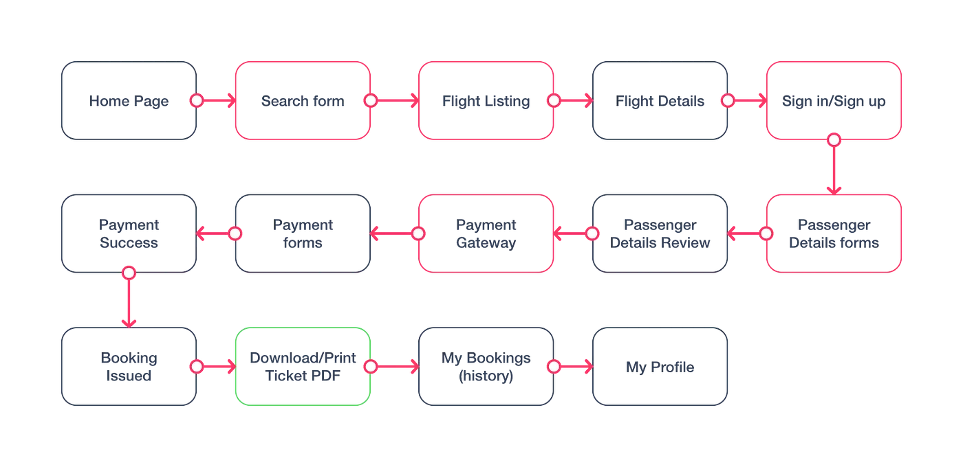
Simplified version of the flow
Ideate
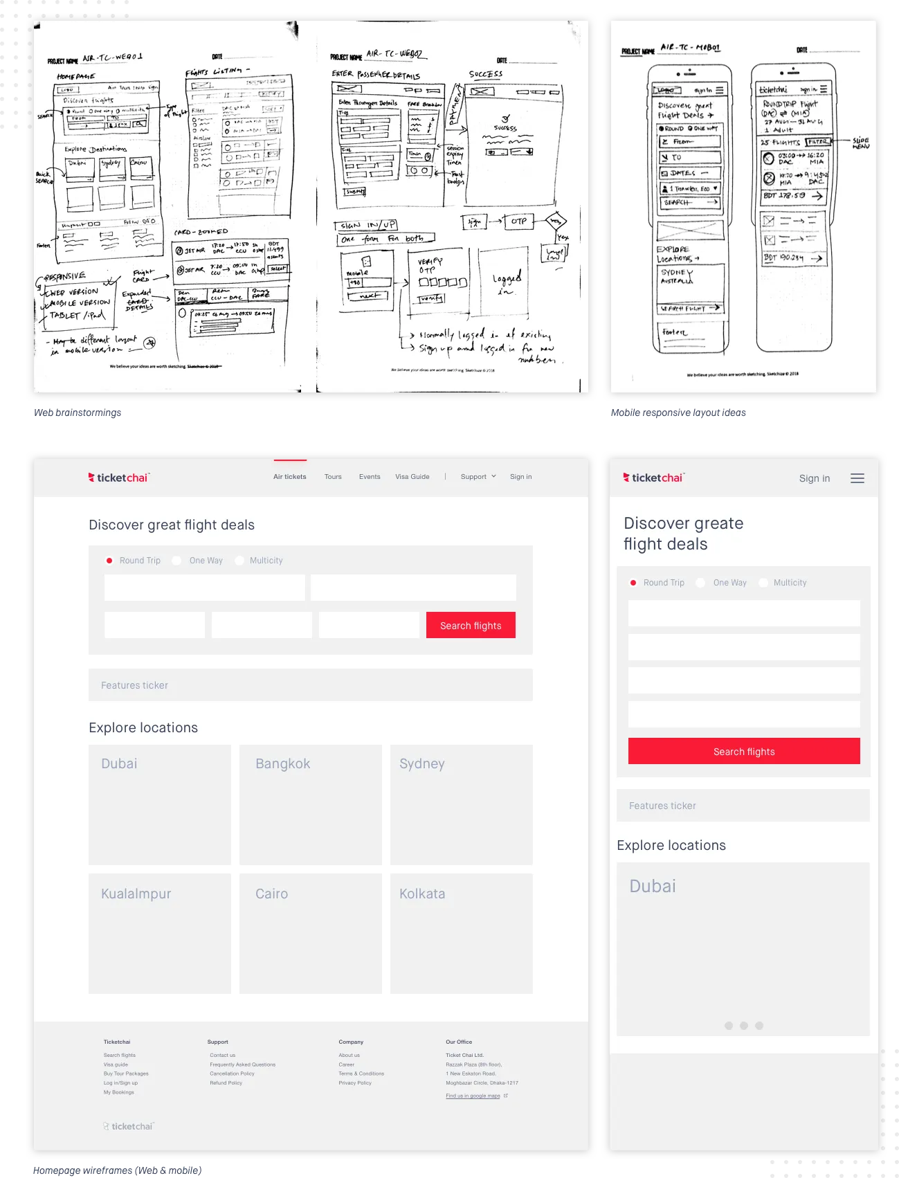
Sketching ideas & a Low Fidelity Prototype
After successfully defining the problems and getting a basic user flow, we can begin to work on some skeleton sketching with the features we wanted to include. This stage had many trials and errors until we get the perfect ones.
Final Designs
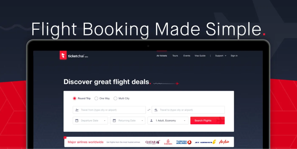
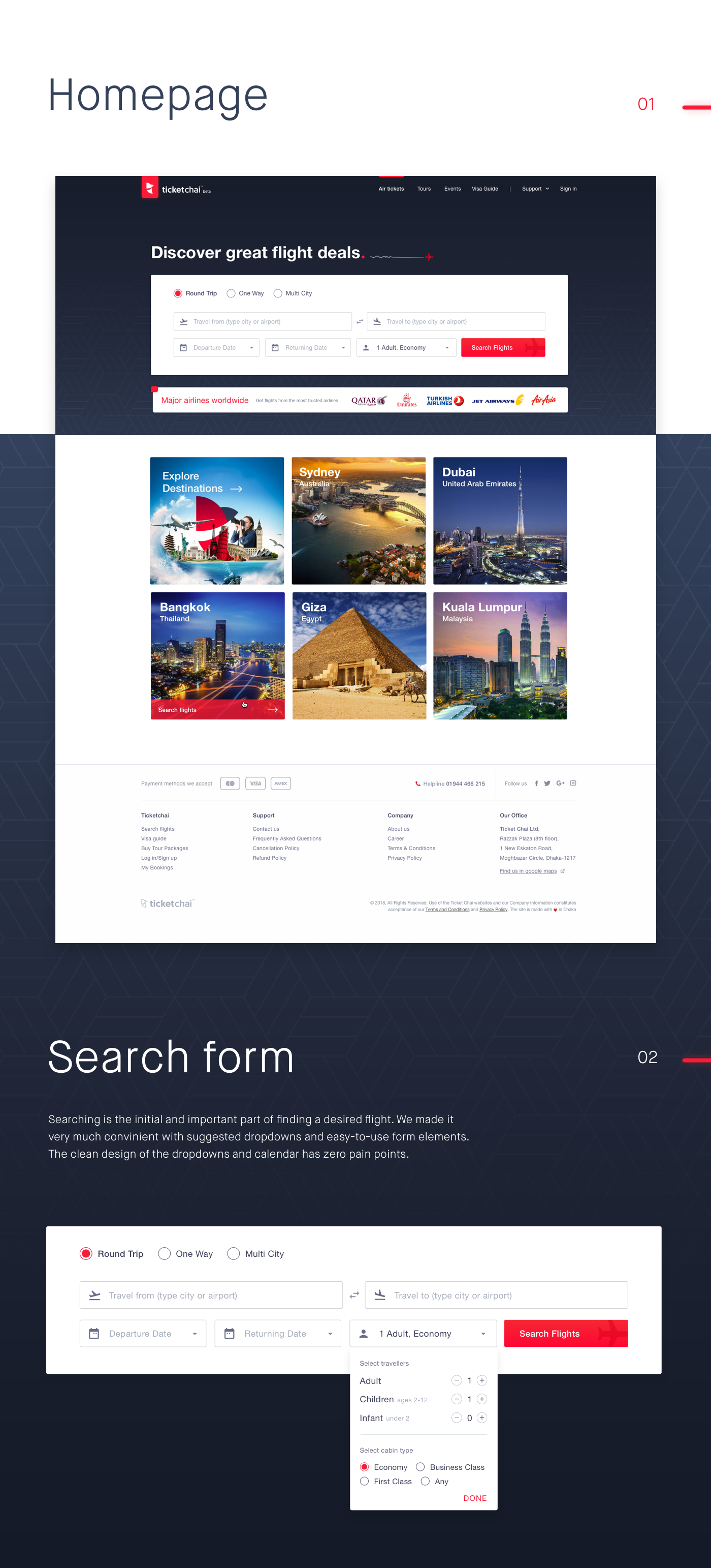
The Homepage
The homepage needed to be clean and should have more focus on the search function. We prioritize that by not adding any unnecessary elements and adding better-organized data. The main two sections are
- Search flight
- Explore Destinations
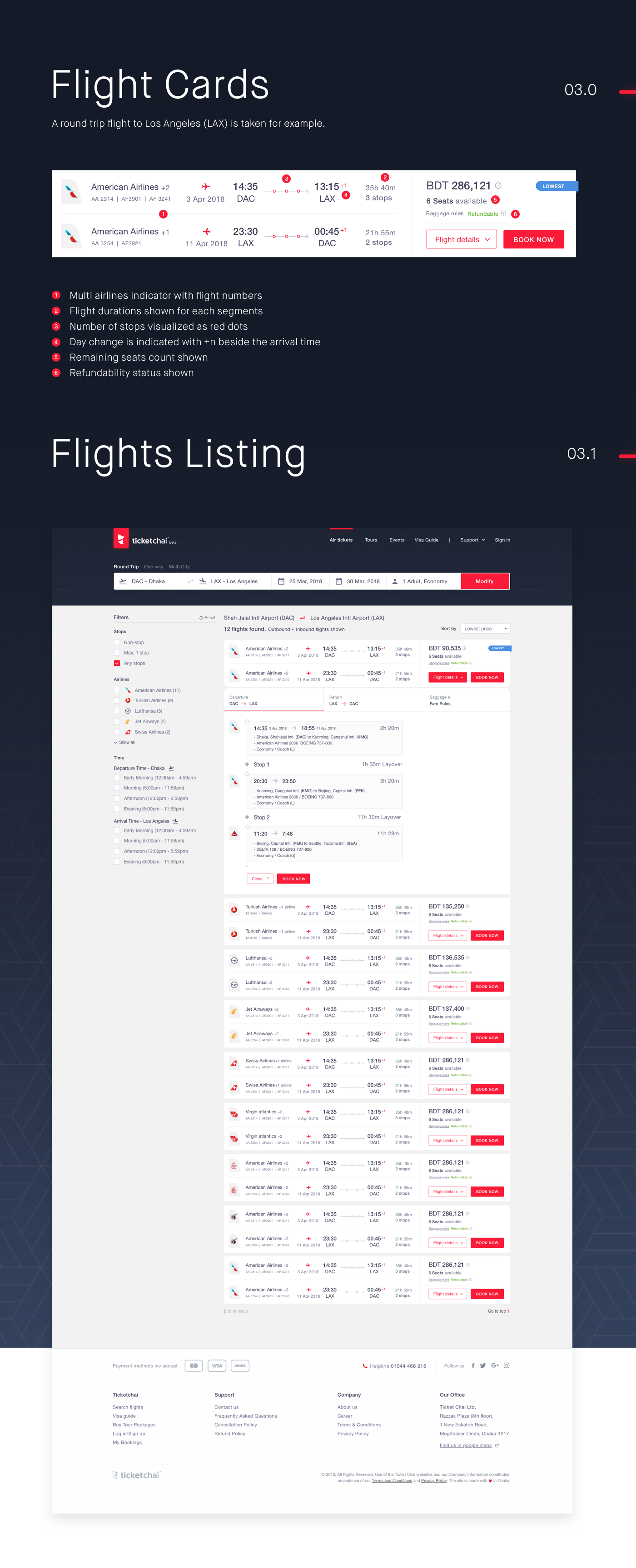
Flight Listing page
This is one of the crucial parts of flight booking where the user will choose and compare from dozens of flights. We made it clean and as self-explanatory as possible without sacrificing any necessary information. Each flight card is expandable to view flight details on this single page. Flight details have all the itinerary segment details and their timings and terminals.
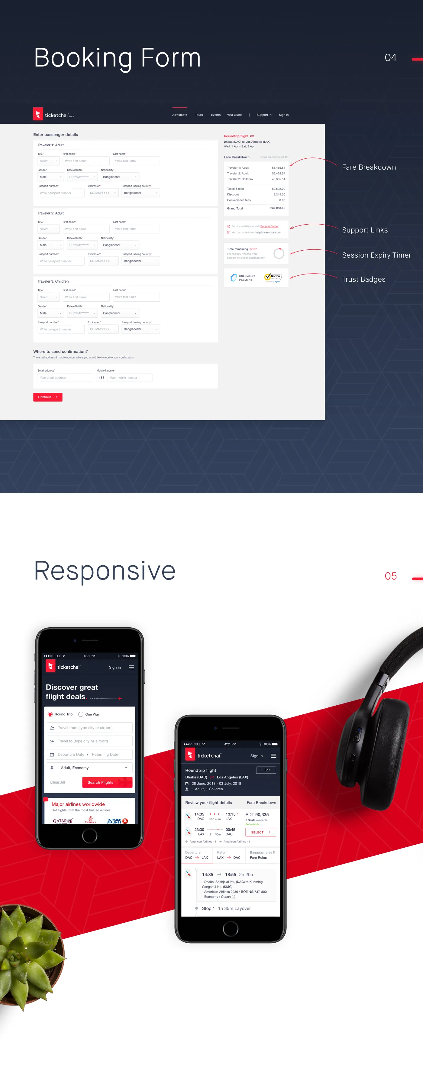
Passenger Details booking form
Entering passenger details might be the most tiresome process for the user while booking a flight. Moreover, this page has a timer that will expire for security reasons. One of the pain points was, there is no indication that this session will expire. And in the middle of filling up the form, it can be very frustrating. So we introduce a clean timer for the page indicating the remaining time for the expiry.
Originally published on Medium
let's talk — [email protected]